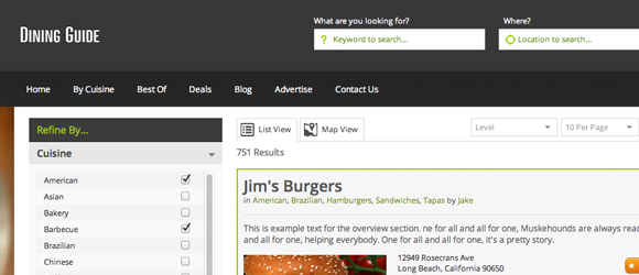
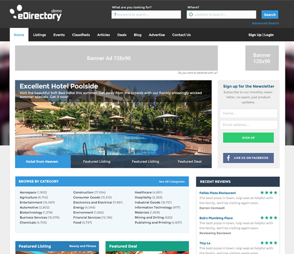
For the last month we have been cranking out some great new features for the Dining Guide edition. These features will also be coming to the main eDirectory theme in the next release a few weeks from now.
Filters:
Refine your search results by Category, Location, Price, Rating or if the result has an available deal.
Map View:
We have added an entirely new map view which allows you to show all results on a handy map – super simple.
In addition, there’s a huge list of fixes, enhancements such as an updated photo gallery, new search bar, new header, and more.
Go and see for yourself – www.demodirectory.com
Next Release – Talk about being Responsive….
We’re well on the way to releasing an all-new default theme…
- A fully responsive design, looks just as awesome on a phone as it does on a desktop.
- Fully integrated with our iOS and Android applications.
- Built on the Brilliant Bootstrap framework.
- Grid layout with ‘Blocks’ making customisation far easier across the board.
- Did we mention it’s stunning? It’s gorgeous.
This (pretty awesome) new front-end will be available in a few weeks. Stay tuned, we just wanted to give you a sneek peek.
Change logs are here…
For all our customers a little more involved with the platforms, we’ve added complete change logs to the main eDirectory site. Just so you can keep up with what we’ve been working on. We’ll be adding to it as time goes on.
Feel free to check them out here: https://www.edirectory.com/edirectory-changelog/


I just wanted to let you know that I am very excited for the release of the new theme. When I spoke to one of your sales team they mentioned that the new theme would be a combination of the look of the Dining Guide with the functionality of the default themes. What I liked most about the Dining Guide is the home page. It has a clean, simple layout with the primary focus being the slider. The Dining Guide slider takes up the whole width of the page (similar to the real estate guide) which is perfect for advertising or communicating to your audience visually. Please keep the slider as wide as possible. I am building a wedding directory so both me and my vendors will be uploading high quality photos. Unfortunately the size of photos attached to the Listings, Article modules etc. are very small and do not help demonstrate our products properly. When the customer clicks on a thumbnail I would like to see the photo enlarge as big as the slider (782 x 782). If this has not been added because of storage then I would be willing to pay more for storage. Thanks and good luck with the new theme:)
Thanks for the feedback!
When is the new theme available?
Hi Kenny,
The new responsive theme will be available today.
Don’t miss our newsletter to know more about it.