This blog post was updated on Nov 6th, 2024.
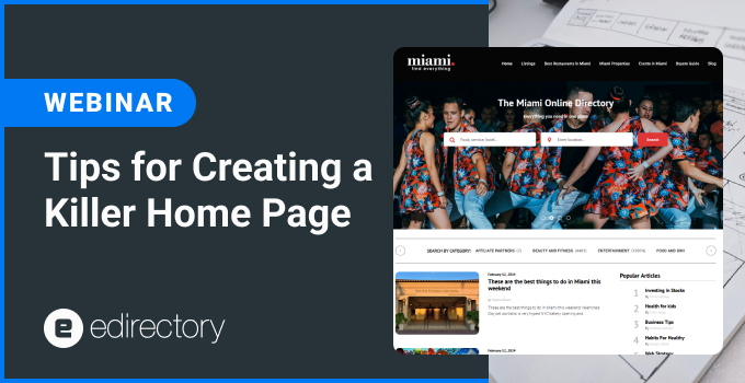
In our latest webinar, “How to Create a Killer Home Page,” we delved into why a powerful, well-designed homepage is essential for online directories. A strong homepage not only captures users’ attention but also guides them seamlessly to explore your offerings. Here, we’ll go over the key takeaways on designing an effective homepage, from understanding user data to choosing the right elements and getting inspired by popular homepage styles.
1. Why is the Home Page So Important?
Your homepage is the first point of interaction for most visitors, and it sets the tone for your entire website. A successful homepage should communicate your site’s purpose, highlight its key features, and provide an intuitive path for users to find what they’re looking for. It’s the start of their journey, and making it effective can mean the difference between high engagement and a quick exit.
2. Collect and Analyze Data
Before diving into design, it’s essential to understand what users need. By collecting and analyzing data, you can gain insights into:
- What Users Are Looking For: Identify popular search terms and content categories.
- Where They’re Clicking: Pinpoint high-interest areas on your homepage to enhance user flow.
- Where They’re Dropping Off: Recognize points of friction to optimize user engagement.
- What You Want Them to See and Click On: Define priorities so you can direct attention to important elements.
With a data-informed approach, your homepage can become a responsive, user-centric space that effectively addresses visitor needs.
3. Formulate Hypotheses
Once you have the data, it’s time to ask key questions to form improvement hypotheses:
- Do I Have Enough Content? Ensure that users have access to enough information without overwhelming them.
- Is My Content Curated Effectively? Focus on quality and relevance, highlighting your best and most valuable content.
- Am I Showcasing the Best I Have? Prioritize premium content, popular listings, or high-value offers.
- Is It Easy to Search? An effective search bar can dramatically improve user experience.
- Does Navigation Assist Users? Good navigation is crucial to help users find what they need effortlessly.
Each of these questions can lead to specific adjustments that enhance your homepage’s clarity and usability.
Webinar: Tips for Creating a Killer Home Page
4. Key Elements: What and Where
Positioning is vital for a successful homepage. Consider what elements are crucial to your directory:
- Location Features: If locations are relevant, showcase them prominently for easy access.
- Most Valuable Modules: Highlight core features like listings, deals, or a mix of both based on your site’s primary offerings.
- Combination Opportunities: Blend elements where possible to offer a rich and cohesive browsing experience.
By prioritizing the most impactful modules, you provide clear, direct paths for users to explore your content.
5. Understanding Page Editor Widgets
Our webinar highlighted several key widgets you can leverage to create a comprehensive homepage layout:
- Header Widgets: Essential for establishing branding and site identity.
- Search Widgets: Make it easy for users to start their journey.
- Card Widgets: Perfect for showcasing featured listings or services.
- Banner Ads Widgets: Useful for promoting offers or ads.
- Events Widgets: Ideal for directories featuring events and local happenings.
- Content Widgets (Blog/Article/Custom Content): Adds depth with additional resources and insights.
- Engagement Widgets (Newsletter/Lead Form): Encourage interaction and sign-ups.
- Footer: Essential for site navigation, contact info, and links to key resources.
Each widget serves a specific purpose, allowing you to structure your homepage effectively to engage users at every step.
6. Four Homepage Styles to Get Inspired
Finally, we discussed four homepage styles that can inspire:
- Minimalist: Clean and uncluttered, focusing on essentials only.
- Short and To The Point: Direct users’ attention to key calls to action.
- Featured Advertisers: Perfect for directories with sponsored listings, emphasizing partners and advertisers.
- Full Page: A bold, immersive style that uses the entire screen, ideal for visually-driven directories.
Each style has its appeal, so choose the one that best aligns with your brand and audience preferences.
Conclusion
Creating a killer homepage involves balancing content, usability, and design. By understanding user behavior, hypothesizing improvements, and using the right widgets and styles, you can create a homepage that not only attracts but also retains users. Try implementing these tips and watch how they transform your directory’s homepage into a high-performing asset.
USEFUL LINKS AND TOOLS MENTIONED IN THE WEBINAR:
*We are not affiliated, associated, authorized, endorsed by, or in any way officially connected to the tools and sites mentioned in the webinar.
This session was recorded on November 6th, 2024.
- Don’t forget to register for eDirectory’s next Webinar.
- Do you want to know what eDirectory can do for you? Sign up for a free guided Demo here.
Want more tips? Shoot us a note at marketing@eDirectory.com.


